Back to the window
Case study · Dental clinic

BrightSmile Dental

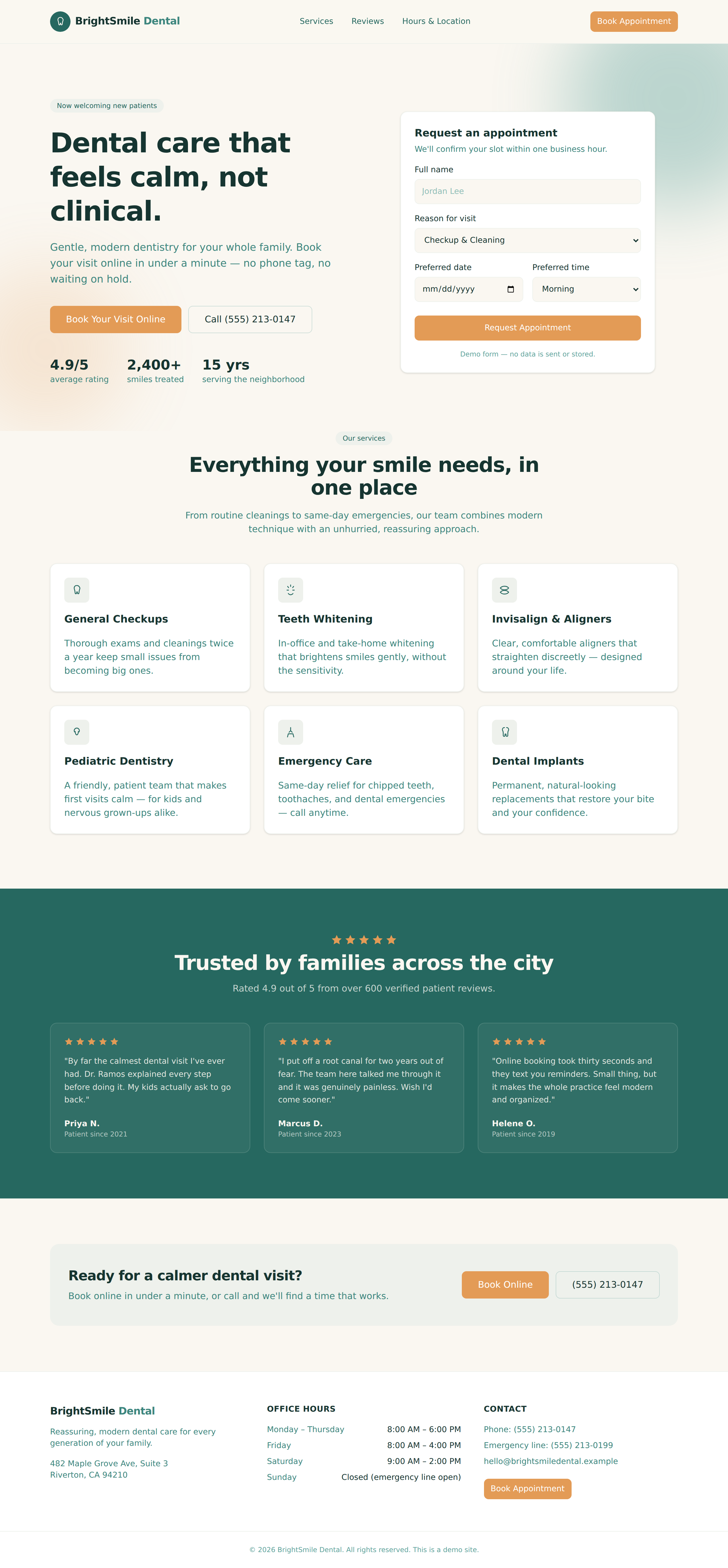
Appointment booking landing — hero with online booking CTA, services grid, trust/reviews strip

Dental clinicAppointment booking landingGenerated build
BrightSmile Dental
The build
BrightSmile Dental — desktop view
Desktop
Guided tour

The brief

BrightSmile Dental needed a booking landing page that turns visitors into scheduled patients: a clear hero with an online booking CTA, a services grid, and a trust/reviews strip to reduce hesitation.

The core idea

Lead with action, not information. The hero puts the booking CTA front and center so patients can act immediately, while supporting sections build confidence as they scroll rather than before they can book.

Hero with online booking CTA

A direct headline and subhead frame the clinic's purpose, paired with a single prominent booking action so there's no ambiguity about the next step.

Services grid

A scannable grid lays out the clinic's offerings, letting visitors quickly confirm BrightSmile provides the care they're looking for before committing to book.

Trust/reviews strip

Placed right after services, this strip reinforces credibility at the exact moment a visitor is deciding whether to trust the clinic with an appointment.

Footer with hours

Practical details like hours close out the page, giving patients the logistical clarity they need without cluttering the earlier, action-focused sections.

Want one like this?

Tell Rada what you have in mind. It builds a bespoke, working demo on the spot.