Back to the window
Case study · Restaurant

Olive & Ember

Menu + reservations — appetising hero, menu sections, reservation CTA

RestaurantMenu + reservationsGenerated build
Olive & Ember
The build
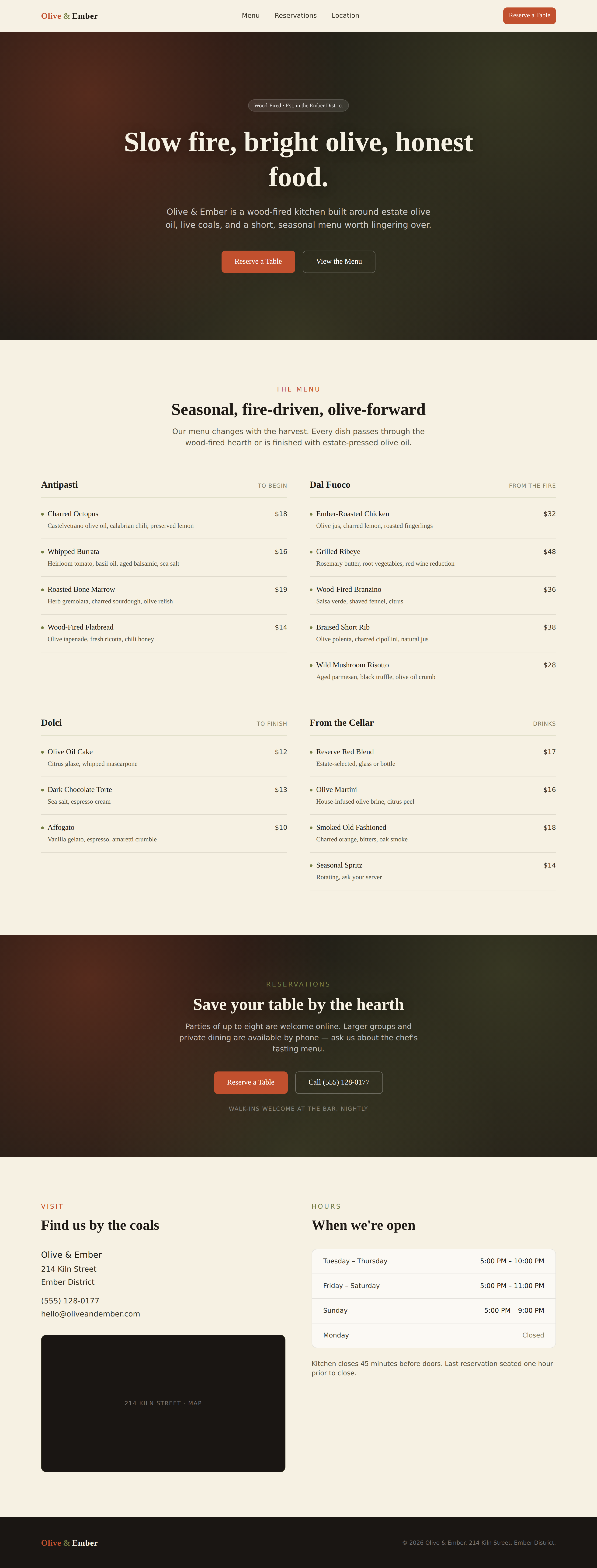
Olive & Ember — desktop view
Desktop
Guided tour

The brief: a menu site that makes you hungry

Olive & Ember needed a site that did two jobs well — show off the food and get people to book a table, without the usual clutter of restaurant sites.

The core idea: hero first, decisions second

Lead with an appetising hero that sets the tone immediately, then guide visitors toward the two decisions that matter: what to eat and when to come in.

Appetising hero

A full-bleed image and headline establish mood before any menu detail loads, giving the brand its moment before the practical content begins.

Menu sections

Dishes are grouped into clear sections so browsing feels like flipping through a physical menu rather than scrolling an undifferentiated list.

Reservation CTA

A persistent, unmissable call-to-action turns interest into action, placed so it's never more than a glance away regardless of where someone is on the page.

Location + hours

Practical details sit at the base of the experience, answering the last question — can I actually get there — without competing with the food story above.

Want one like this?

Tell Rada what you have in mind. It builds a bespoke, working demo on the spot.